I recently had reason to combine stacked and dodged bar charts in ggplot. Why might one want to do this? Well, in my case I had some data that contained counts for three types of responses, two negative and one positive. I wanted to plot counts of negative vs positive responses, but I didn’t want to lose the detail of the two different negative categories.
Here’s an example of the type of data I’m talking about.
library(tidyverse)
set.seed(432)
df <- tibble(q = LETTERS[1:6],
             Good = sample(10:20, 6, replace=T),
             Bad = sample(1:15, 6, replace=T),
             Ugly = sample(1:15, 6, replace=T))
The typical approach would be to simply dodge the bars like so:
df |>
  pivot_longer(Good:Ugly, names_to = "rating", values_to = "n") |>
  mutate(rating = factor(rating, levels = c("Good", "Bad", "Ugly"), ordered = T)) |>
  ggplot(aes(x = n, y = q, fill = rating))+
  geom_col(position="dodge")+
  theme_bw()+
  theme(legend.title=element_blank(),
        legend.position="bottom")+
  labs(x="Count",
       y = NULL)+
  scale_fill_manual(values=c("darkgreen","orange","red"))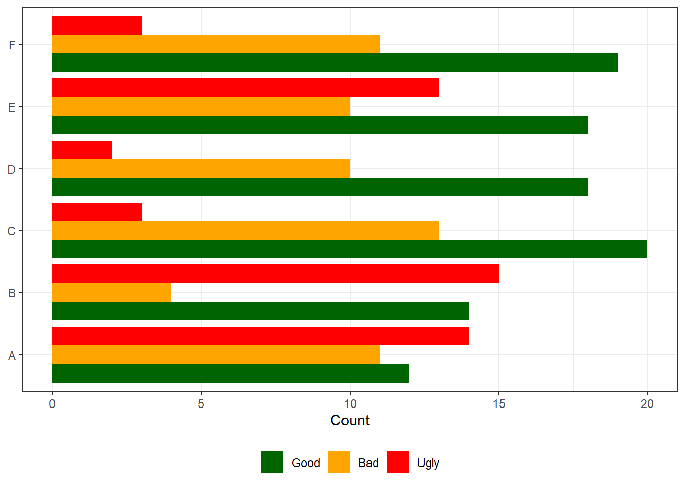
But I wanted to stack the bars for Bad and Ugly. My first impulse was to create a new valence variable that was “Positive” for Good ratings, and “Negative” for Bad and Ugly ratings, and use that as a grouping variable to control the dodging.
df |>
  pivot_longer(Good:Ugly, names_to = "rating", values_to = "n") |>
  mutate(rating = factor(rating, levels = c("Good", "Bad", "Ugly"), ordered = T),
         valence = if_else(rating == "Good", "Positive", "Negative")) |>
  ggplot(aes(x = n, y = q, fill = rating, group = valence))+
  geom_col(position="dodge")+
  theme_bw()+
  theme(legend.title=element_blank(),
        legend.position="bottom")+
  labs(x="Count",
       y = NULL)+
  scale_fill_manual(values=c("darkgreen","orange","red"))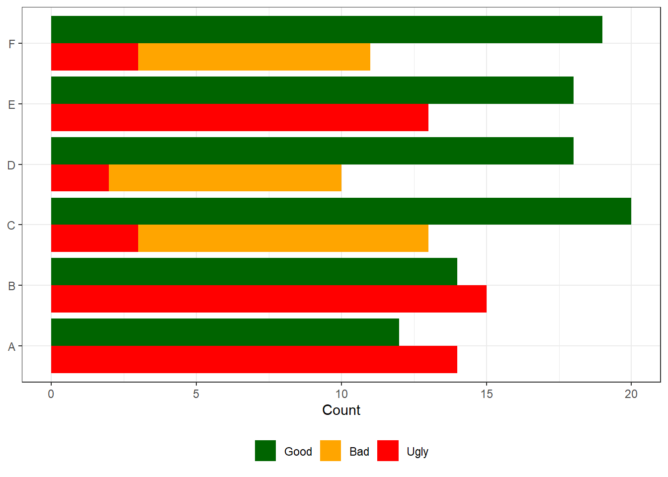
Unfortunately this approach leads to bars for Bad and Ugly being plotted in the same location, so Ugly occludes Bad. To get around this I needed to hack the data.
The hack is to add the count for Ugly to the count for Bad. This way, when plotting as above, ggplot will first put down an orange bar that represents the sum of Ugly and Bad, and then layer on top of that a red bar for Ugly only. Hence, the part of the orange bar that isn’t occluded will accurately show the value for Bad.
df |>
  mutate(Bad = Bad + Ugly) |>
  pivot_longer(Good:Ugly, names_to = "rating", values_to = "n") |>
  mutate(rating = factor(rating, levels = c("Good", "Bad", "Ugly"), ordered = T),
         valence = if_else(rating == "Good", "Positive", "Negative")) |>
  ggplot(aes(x = n, y = q, fill = rating, group = valence))+
  geom_col(position="dodge")+
  theme_bw()+
  theme(legend.title=element_blank(),
        legend.position="bottom")+
  labs(x="Count",
       y = NULL)+
  scale_fill_manual(values=c("darkgreen","orange","red"))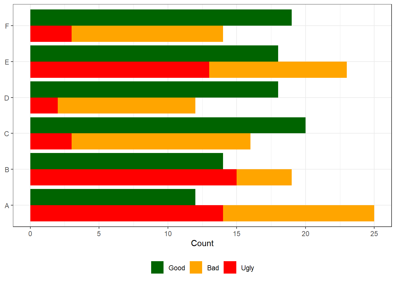
Ta-da! It’s a simple hack to solve a rare use case.