Accessibility is an important part of data visualisation, and one common piece of advice to improve accessibility for people who are colourblind or have other visual impairments is to use fill patterns rather than relying on colour alone. This is good advice, but a lot of the examples shown online are, for want of a better word, ugly. Many also suffer from the additional issue that adding many different patterns to a data visualisation can make it visually overwhelming, unintentionally making it less accessible to most readers.
I suggest that in most cases, rather than using different patterns we should be keeping the pattern type consistent but varying the parameters of said pattern. An example will hopefully make this less cryptic.
This is the most common use of patterns that I see.
library(tidyverse)
library(ggpattern)
library(scales)

df_1 <- tibble(x = c("stripe", "weave", "wave", "circle")) |>
  mutate(y = 10,
         x = factor(x, levels = x, ordered = T))

ggplot(df_1, aes(x = x, y = y))+
  geom_col_pattern(aes(fill = x,
                       colour = x,
                       pattern = x),
                   pattern_key_scale_factor=.5,
                   pattern_size = 0,
                    pattern_frequency = 10,
                   linewidth = .75)+
  scale_pattern_manual(values= as.character(df_1$x)) +
  scale_x_discrete(labels = label_wrap(12))+
  labs(x = NULL,
       y = NULL)+
  theme(legend.key.size = unit(1, 'cm'),
        legend.title = element_blank())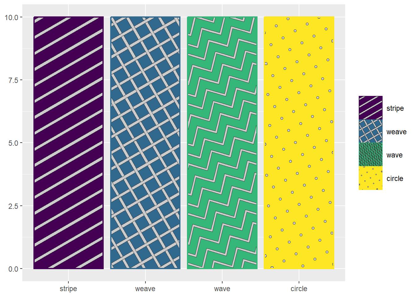
I admit that’s a bit of an exaggeration, but it does assault the eyes. So here’s a gentler option that only uses solid bars and stripe patterns of different widths and orientations.
dark <- "#191970"
light <- "#156064"

df_2 <- tibble(x = c("Solid dark",
                     "Solid light",
                     "45 stripe narrow dark",
                     "45 stripe wide",
                     "45 stripe narrow light",
                     "-45 stripe narrow dark",
                     "-45 stripe wide",
                     "-45 stripe narrow light")) |>
  mutate(y = 10,
         x = factor(x, levels = x, ordered = T))

ggplot(df_2, aes(x = x, y = y))+
  geom_col_pattern(aes(
      fill = x,
      pattern = x,
      pattern_angle = x,
      pattern_density = x),
      colour = dark,
      pattern_fill = light,
      pattern_size = 0,
      linewidth = .75,
      pattern_key_scale_factor=.5)+
  scale_fill_manual(values = c(dark, light, rep(dark, 6)))+
  scale_pattern_discrete(choices = c(rep(NA, 2), rep("stripe", 6)))+
  scale_pattern_angle_manual(values = c(rep(0, 2), rep(45, 3), rep(-45, 3)))+
  scale_pattern_density_manual(values = c(rep(0, 2), rep(c(.2, .5, .8), 2)))+
  scale_x_discrete(labels = label_wrap(12))+
  labs(x = NULL,
       y = NULL)+
  theme(legend.key.size = unit(1, 'cm'),
        legend.title = element_blank())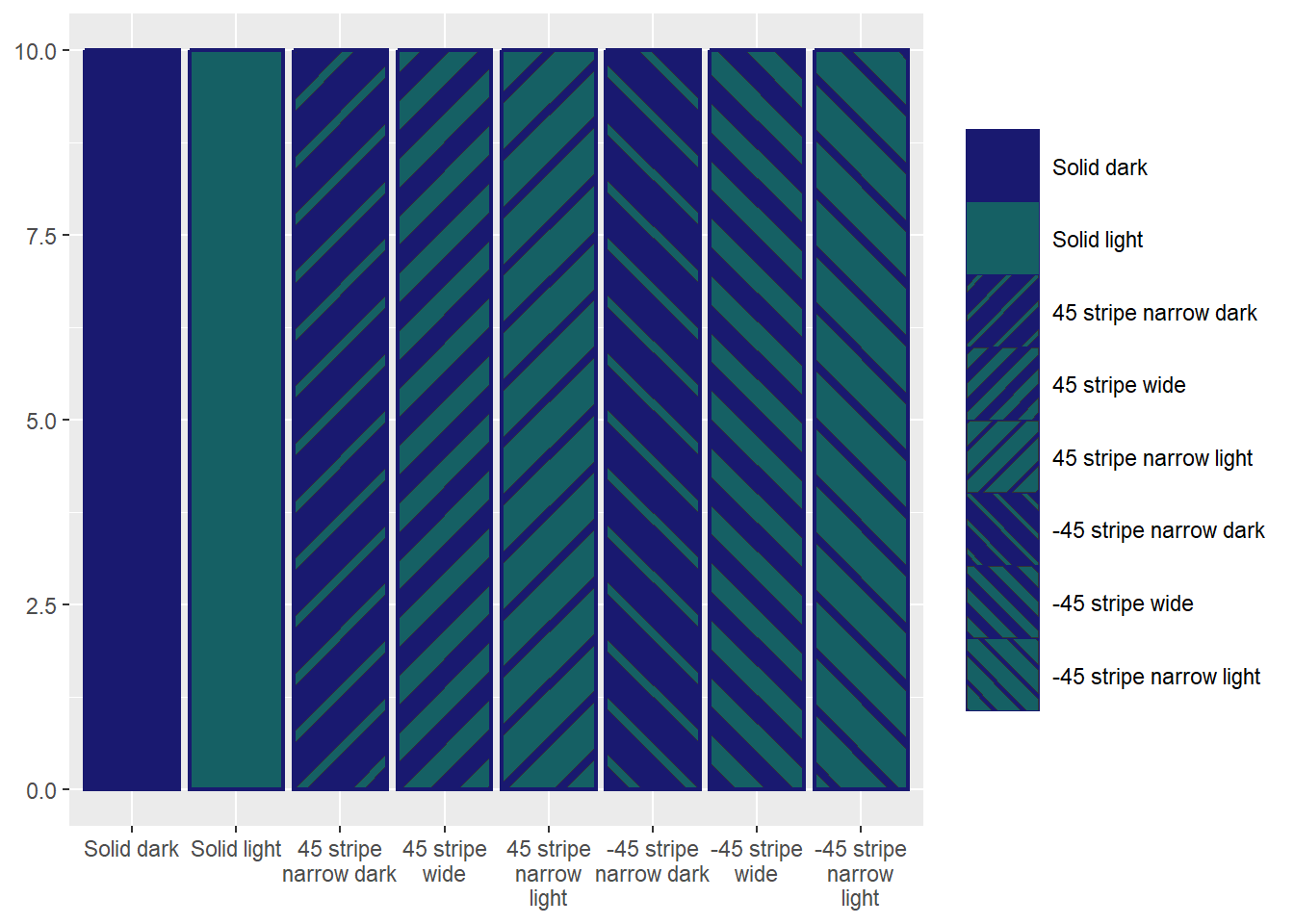
There’s still a fair bit going on here, but we’ve managed to visually distinguish 8 categories with less visual noise than the earlier version to distinguish between 4.