Suppression in data visualisation
Many public organisations follow data suppression rules for tabular aggregate data, for example the Australian Bureau of Statistics. And those that don’t really should.
But most guidance I’ve seen covers tabular data only, which means we are somewhat on our own regarding how to suppress data in visualisations. I’ve been experimenting recently with some approaches to this problem. I’ll start by creating some sample data.
library(tidyverse)
df <- tibble(x_variable = LETTERS[1:5],
                         count = seq(from = 2, to  = 18, by = 4))
Next, I apply a suppression rule whereby I don’t show any counts of less than 10. I’ll also create some helper variables.
df <- df %>%
  mutate(suppressed = count < 10,
         count_plotting = if_else(suppressed == T, 10, count), # For counts less than 10, I will use 10 as the length of the bars rather than the true count
         label_variable = if_else(suppressed == T, "< 10", as.character(count))) # Again, for counts < 10, the label "< 10" will be used rather than the true count
One option is to use a partially transparent bar to represent where data has been suppressed.
ggplot(df, aes(x = x_variable, y = count_plotting, pattern = suppressed, label = label_variable, alpha = suppressed))+
  geom_col(fill = "#191970")+
  geom_text(nudge_y = 1)+
  scale_alpha_manual(values = c(1, .5))+
  labs(x = NULL,
       y = NULL)+
  theme_bw()+
  theme(legend.position = "none")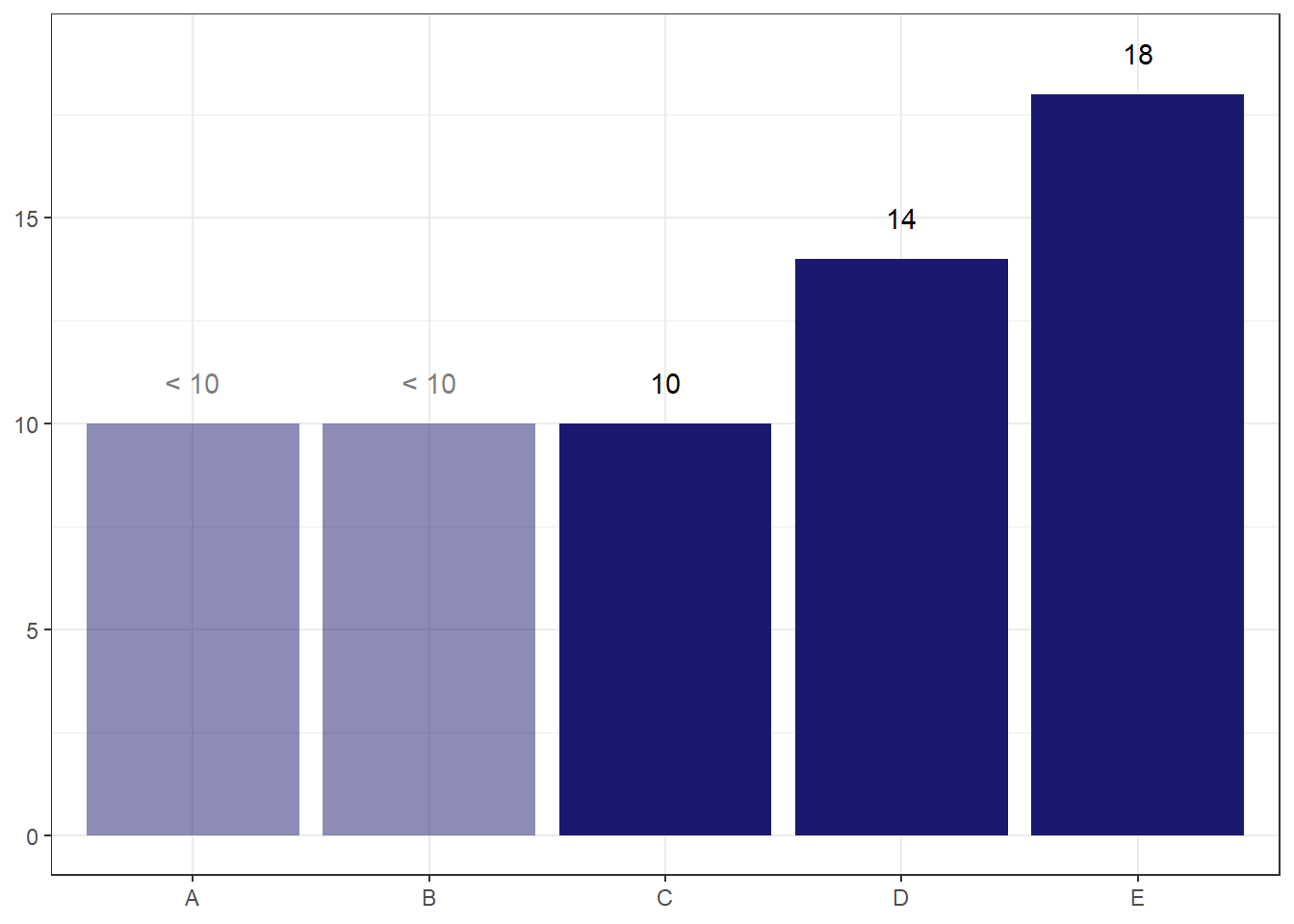
The main risk I see with this option is that readers may default to thinking the value is actually 10, despite the transparency and the label.
I can potentially ameliorate this risk by making the end point of the bar less obvious via a gradient fade to transparent.
library(ggpattern)
ggplot(df, aes(x = x_variable, y = count_plotting, pattern = suppressed, label = label_variable, fill = suppressed))+
  geom_col_pattern(pattern_fill = "#191970",
                   pattern_fill2 = "#00000000",
                   colour = "#00000000")+
  geom_text(nudge_y = 1)+
  scale_fill_manual(values = c("#191970", "#00000000"))+
  scale_pattern_discrete(choices = c(NA, "gradient"))+
  labs(x = NULL,
       y = NULL)+
  theme_bw()+
  theme(legend.position = "none")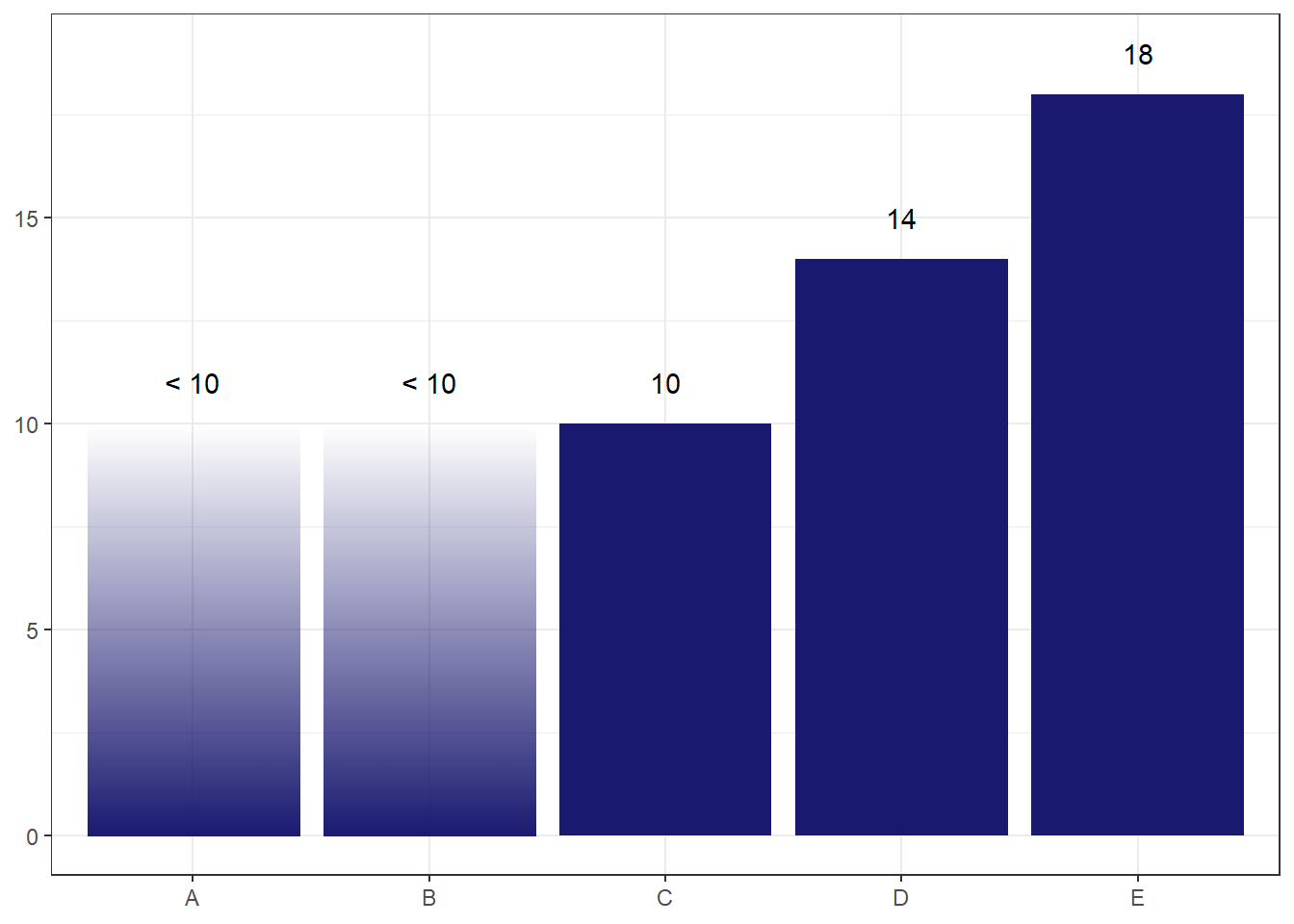
The concern I have with this one is that readers may think the alpha level encodes something about the probability of where the true count lies, so may assume that lower values are less likely. But the probability distribution is actually uniform, so we don’t want to give this implication.
Perhaps a simpler option is the best.
ggplot(df, aes(x = x_variable, y = count_plotting, pattern = suppressed, label = label_variable, fill = suppressed, linetype = suppressed, colour = suppressed))+
  geom_col(linewidth = 1)+
  geom_text(nudge_y = 1)+
  scale_fill_manual(values = c("#191970", "#00000000"))+
  scale_colour_manual(values = c("#191970", "grey35"))+
  scale_linetype_manual(values = c("solid", "dashed"))+
  labs(x = NULL,
       y = NULL)+
  theme_bw()+
  theme(legend.position = "none")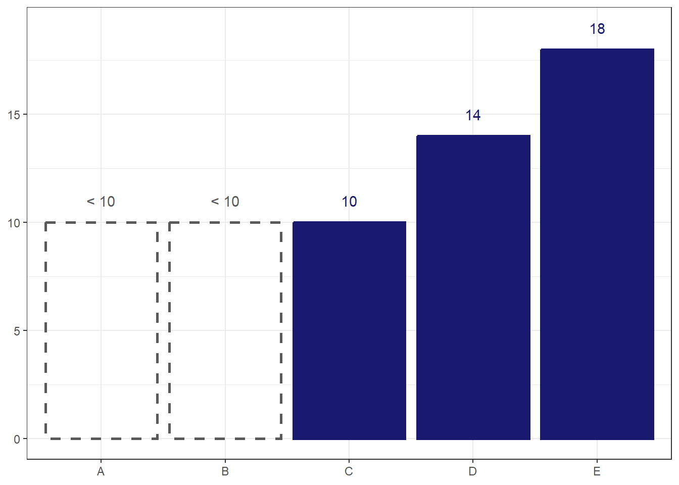
I think this option works the best. The total transparency and dotted outline make the bars look ‘empty’, sending a clear visual cue that there is something different about them. Still, visually representing suppressed data is rare enough that I would want to take some time to introduce the reader to what the ‘empty’ bars mean before using them in a chart.