Recently at work I was tracking the response rate of a survey, so I put together a step chart to keep track of it. Here’s a simulated version of what the data looked like.
set.seed(8925)
df <- tibble(date = as.Date(paste0("2025-06-", 1:15)),
             day_rr = c( # Simulate per-day response rates
               sample(seq(2.5, 10, by = 2.5), 7, prob = c(.1, .2, .4, .3), T), # Slightly higher response rate in the first week of the survey
               sample(seq(0, 7.5, by = 2.5), 8, prob = c(.1, .4, .4, .1), T)
             )) %>%
  mutate(tot_rr = cumsum(day_rr)) # Calculate the cumulative response rate
head(df)
## # A tibble: 6 × 3
## date day_rr tot_rr
## <date> <dbl> <dbl>
## 1 2025-06-01 7.5 7.5
## 2 2025-06-02 5 12.5
## 3 2025-06-03 7.5 20
## 4 2025-06-04 7.5 27.5
## 5 2025-06-05 7.5 35
## 6 2025-06-06 5 40And the original chart.
# Create a vector containing the current response rate, for use in the subtitle
vec_rr <- df %>%
  slice_max(date) %>%
  mutate(tot_rr = paste0(tot_rr, "%")) %>%
  pull(tot_rr)

# Create a lookup for the full survey period of 3 weeks, to use as a comparator
lkp_period <- tibble(date = as.Date(c("2025-06-01", "2025-06-21")),
                     tot_rr = c(0, 100))

df %>%
  ggplot(aes(x = date, y = tot_rr))+
  geom_line(data = lkp_period, color = "#C5D8D1", linetype = "dashed", linewidth = 1)+ # Add a comparator line showing where the response rate would be for a linear path to 100%
  geom_step(linewidth = 1, color = "#191970")+
  geom_point(data = filter(df, date == max(date)), size = 2, color= "#191970", fill = "white", shape = 21, stroke = 1.5)+
  labs(x = NULL,
       y= "Response Rate",
       title = "2025 response rates",
       subtitle = paste(vec_rr, "as of", format(max(df$date), "%A, %d %B")))+
  theme_bw()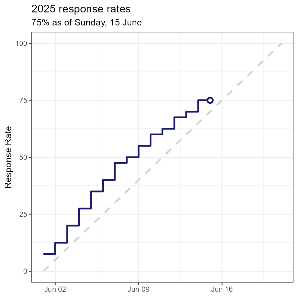
When I showed this chart to colleagues, one mentioned that it reminded her of the old Nokia game Snake. So, with a little tweaking it became this.
nokia_green <- "#A9E001"

df %>%
  ggplot(aes(x = date, y = tot_rr))+
  geom_point(data = filter(df, date == max(date)), size = 4, shape = 15)+ # The 'head' of the snake
  geom_step(linewidth = 3, color = "black")+ # The body of the snake
  geom_step(linewidth = .75, color = nokia_green, linetype = "dotted")+ # The pattern on the snake's body
  geom_point(data = filter(lkp_period, date == max(date)), size = 3, shape = 18)+ # Instead of a reference line, have the snake aiming towards an orb at 100%
  labs(x = NULL,
       y= "Response Rate",
       title = "2025 response rates",
       subtitle = paste(vec_rr, "as of", format(max(df$date), "%A, %d %B")))+
  theme_classic()+
  theme(panel.border = element_rect(color = "black", # Theme the background to look like my old Nokia 3310
                                    fill = NA,
                                    linewidth = 2),
        panel.background = element_rect(fill = nokia_green),
        plot.background = element_rect(fill = nokia_green),
        text=element_text(family="OCR A Extended"))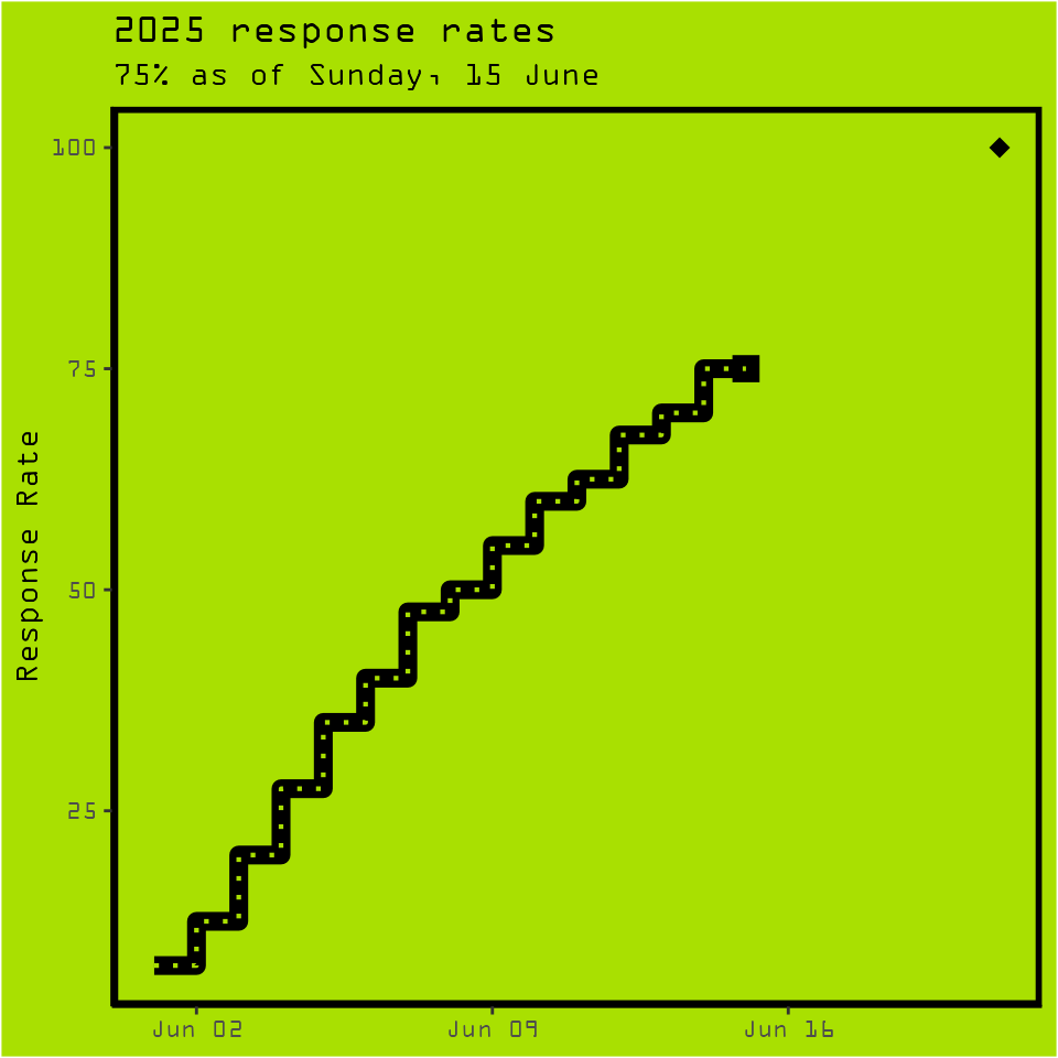
It was a fun little reminder that not every chart needs to be minimalist and sleek. It did the job too, with the revised design getting more of the team interested in the data.